transform的scale属性实现对大屏的适配
最近公司做的大屏用到了transform的scale属性来对大屏网页,进行缩放。缺点:需要给项目大屏,设定固定的宽高,当使用的屏幕分辨率和项目不一致时,会出现左右或者上下的留白。如果设计稿是1920*1080的尺寸,项目中用px来写宽高的话,如果把尺寸改成小于1920的话宽度是超出的,所以项目中还是需要使用%来配合scale属性的缩放。优点:在任何屏幕中项目都会等比例缩放以下是基于vue项目的pu
·
- 最近公司做的大屏用到了transform的scale属性来对大屏网页,进行缩放。
- 缺点:需要给项目大屏,设定固定的宽高,当使用的屏幕分辨率和项目不一致时,会出现左右或者上下的留白。如果设计稿是1920*1080的尺寸,项目中用px来写宽高的话,如果把尺寸改成小于1920的话宽度是超出的,所以项目中还是需要使用%来配合scale属性的缩放。
- 优点:在任何屏幕中项目都会等比例缩放
- 以下是基于vue项目的
- public/index.html
  #app {
    /* user-select: none; */
    overflow: hidden;
    position: relative;
    width: 100%;
    height: 100vh
  }
- 新建组件ScaleBox
- 这个组件里面的代码是最核心的
<template>
  <div
    class="ScaleBox"
    ref="ScaleBox"
    :style="{
      width: width + 'px',
      height: height + 'px'
    }"
  >
    <slot></slot>
  </div>
</template>

<script>
export default {
  name: 'ScaleBox',
  props: {},
  data () {
    return {
      scale: 0,
      width: 2560,
      height: 1080
    }
  },
  mounted () {
    this.setScale()
    window.addEventListener('resize', this.debounce(this.setScale))
  },
  methods: {
    getScale () {
      const { width, height } = this
      const wh = window.innerHeight / height
      const ww = window.innerWidth / width
      console.log(ww < wh ? ww : wh)
      return ww < wh ? ww : wh
    },
    setScale () {
      // if (window.innerHeight == 1080) {
      //   this.height = 1080
      // } else {
      //   this.height = 937
      // }
      this.scale = this.getScale()
      if (this.$refs.ScaleBox) {
        this.$refs.ScaleBox.style.setProperty('--scale', this.scale)
      }
    },
    debounce (fn, delay) {
      const delays = delay || 500
      let timer
      return function () {
        const th = this
        const args = arguments
        if (timer) {
          clearTimeout(timer)
        }
        timer = setTimeout(function () {
          timer = null
          fn.apply(th, args)
        }, delays)
      }
    }
  }
}
</script>

<style lang="scss">
#ScaleBox {
  --scale: 1;
}
.ScaleBox {
  position: absolute;
  transform: scale(var(--scale)) translate(-50%, -50%);
  display: flex;
  flex-direction: column;
  transform-origin: 0 0;
  left: 50%;
  top: 50%;
  transition: 0.3s;
  z-index: 999;
  background: rgba(255, 0, 0, 0.3);
}
</style>
- 组件我已经进行了全局注册,这里就不在赘述
- 组件引用 Home.vue
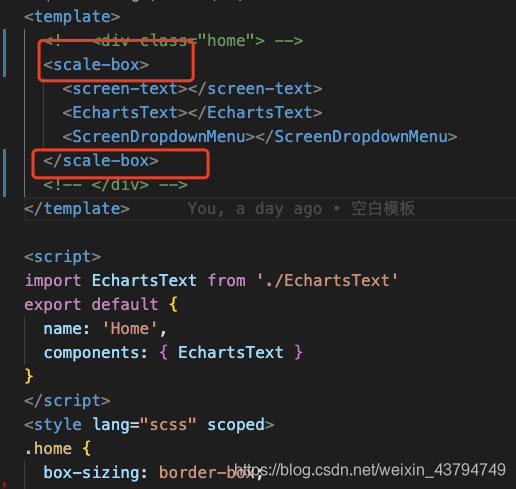
- 一定是scale-box组件要包裹页面的所有的内容才可以达到缩放
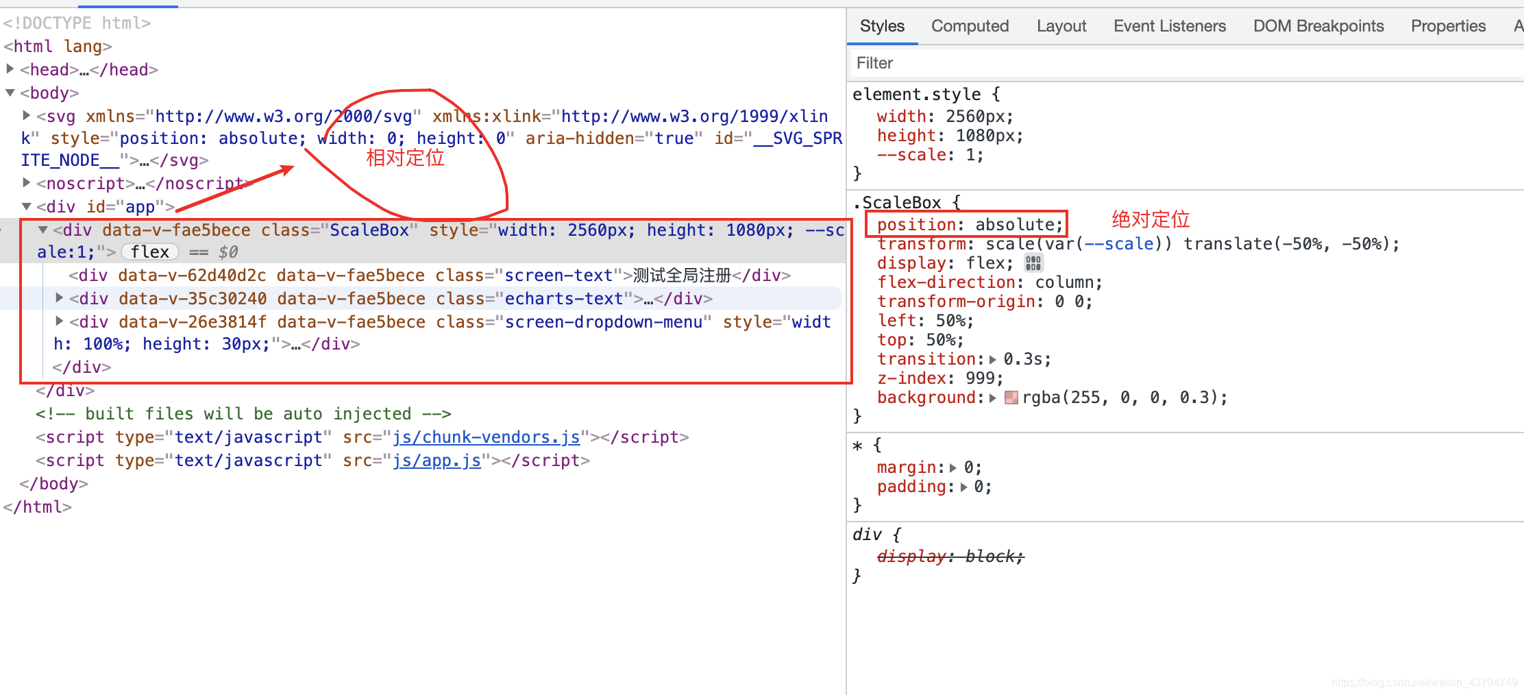
- 现在我给ScaleBox组件设置的是宽2560高1080
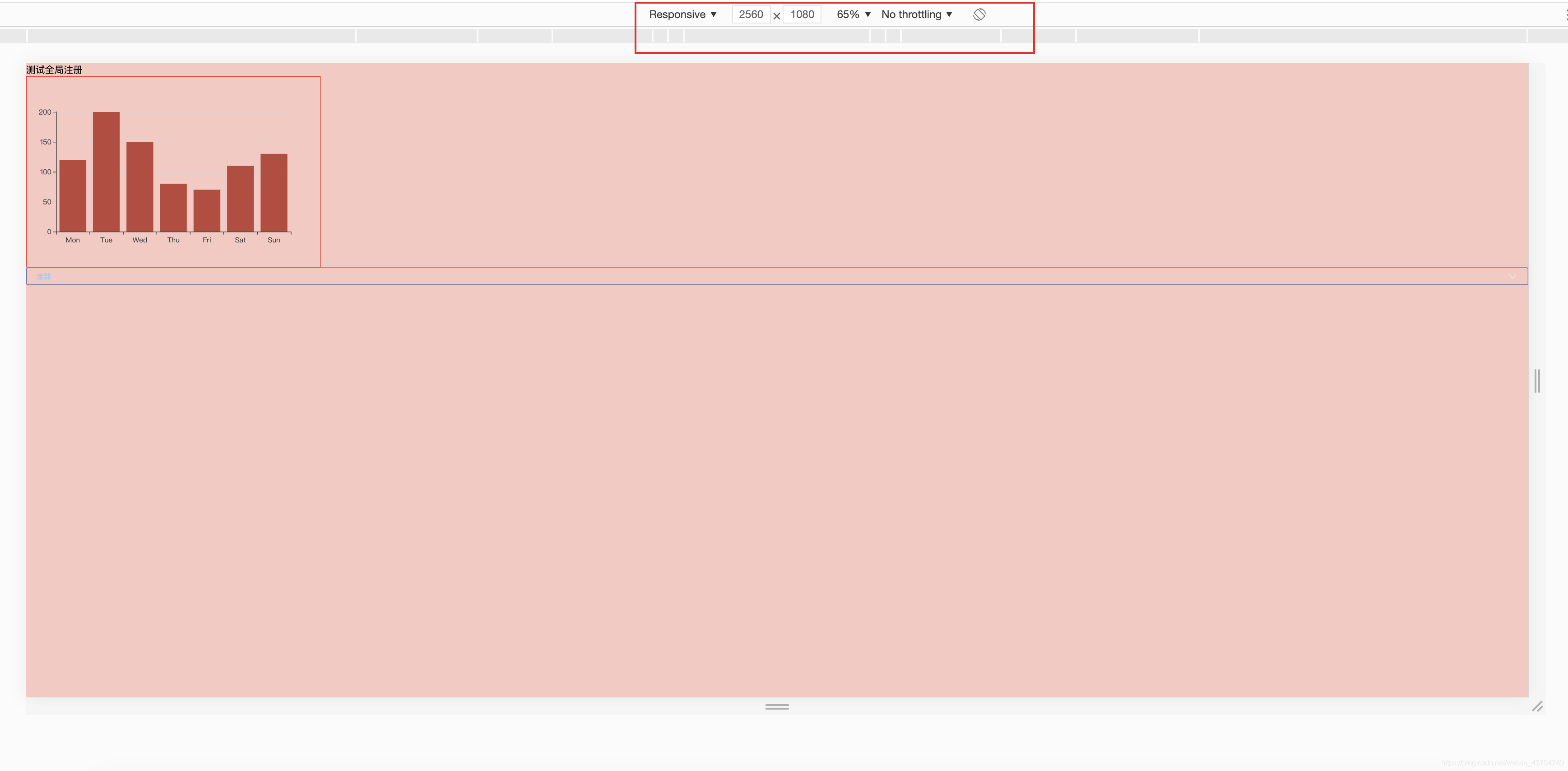
- 此时的效果是全部充满的
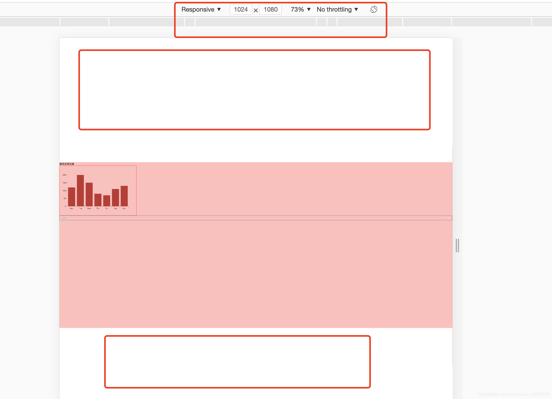
- 此时是有上下留白的,但整体的网页是缩小的还是可以看到的
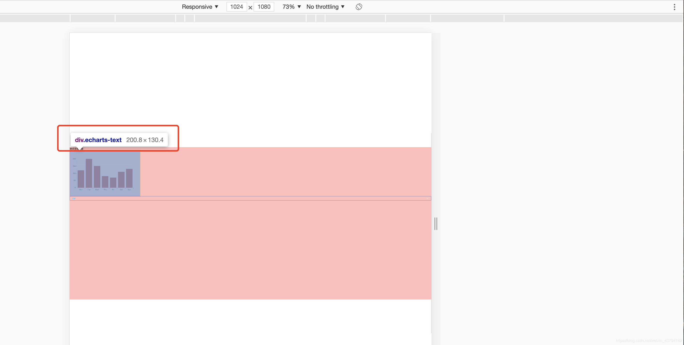
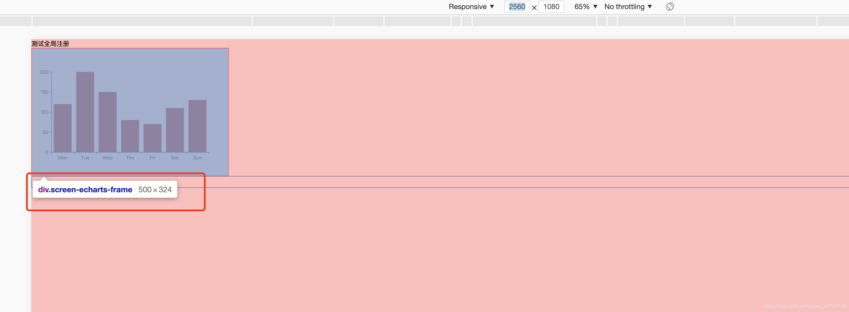
- 不同分辨率下div盒子的宽度也是不一样的,echarts的div盒子我项目中设置的是500px
- scale 也可以对网页进行缩放,但是需要注意的是项目中宽和高的尽量用%。
- 更推荐使用rem布局vue中PC端,移动端,H5使用lib-flexible(rem)做适配
- 以上是自己的见解,如有错误欢迎指正。

智屏生态联盟致力于大屏生态发展,利用大屏快应用技术降低开发者开发、发布大屏应用门槛
更多推荐

 7
7 0
0- 0


 已为社区贡献1条内容

所有评论(0)